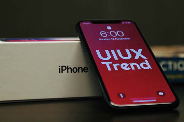
(Image credit: EverythingApplePro)
There’s a rumor from Economic Daily News that Apple has conducted testing on its foldable iPhone prototype. If it is officially rolled out (we have no information at the moment), Apple will join the league of Samsung and Google in trying to make the foldable phone mainstream.
While it is a product designer’s job to design a good foldable phone that is durable, UX designers of websites, apps, or platforms will need to make sure that your all digital touchpoints function and behave properly on a foldable phone.
Before we go into details on how to improve the UX for a foldable phone, let’s understand how does a foldable phone stands out.
How does a foldable phone stands out
The true selling point of a foldable phone is its multitasking ability.
A foldable phone is able to provide better a experience for multitasking (when screens are split) while also enabling an immersive experience like all other smartphones (when screens are not split).
If not properly configured, your websites and apps can be a disaster when viewed on a foldable phone.
How to improve the UX of websites and apps on a foldable phone
If UX for foldable phones still hasn’t crossed your mind, as a UX designer, you will most likely need to take care of one soon. Below are some of the basic to start with:
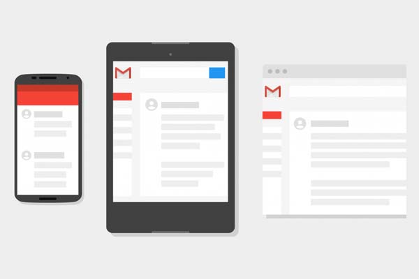
1. Resizable and auto-layout
Make sure that your website or app has dynamic resizing and auto-layout according to screen sizes.
For example, a button horizontally centered at the bottom should always appear at the bottom and horizontally centered, regardless of the screen width and height.
2. Thorough testing across all sizes and devices
QA testing and usability testing should be conducted for all conventional screen sizes. This is important to ensure that your app or website displays perfectly for all the users.
Do not fret if you don’t own all the devices. You can use online tools such as a multi-screen resolution tester, responsive design checker, or simply inspect element to change the resolution of your browser.
3. Visibility of system status
Visibility of system status is one of the common UX heuristics. It suggests that should users should always be informed about what is going on.
As multitasking is the essence of a foldable phone, it is expected for a foldable phone to support more tasks being carried out at the same time. The best experience should work such that users are always aware of what is happening, especially from transitioning from app to app.
When transitioning from the previous app to the current app, the current app should resume in the same state and location. If it does not resume the same, users should be informed properly through a prompt.
4. Sufficient information design
With multitasking, too much content might cramp the display and overload the users with information. Focus on providing the essential information that your users will find useful.
If you are not sure what to show and how much to show, always conduct user research to empathize with the users. Also, read the top content strategy trends for 2021.
5. Accessibility
Always put accessibility in your checklist when you are doing anything related to design or UX.
Accessibility is one of the top UI UX trends in 2021. Accessibility is a practice to make sure that no one is left out when using your app or digital platform, especially for people with special needs, disabilities, or impairments.
You may start incorporating accessibility by:
- Allow both dark mode and light mode
- Support text resizing
- Use distinguishable and contrasting colors