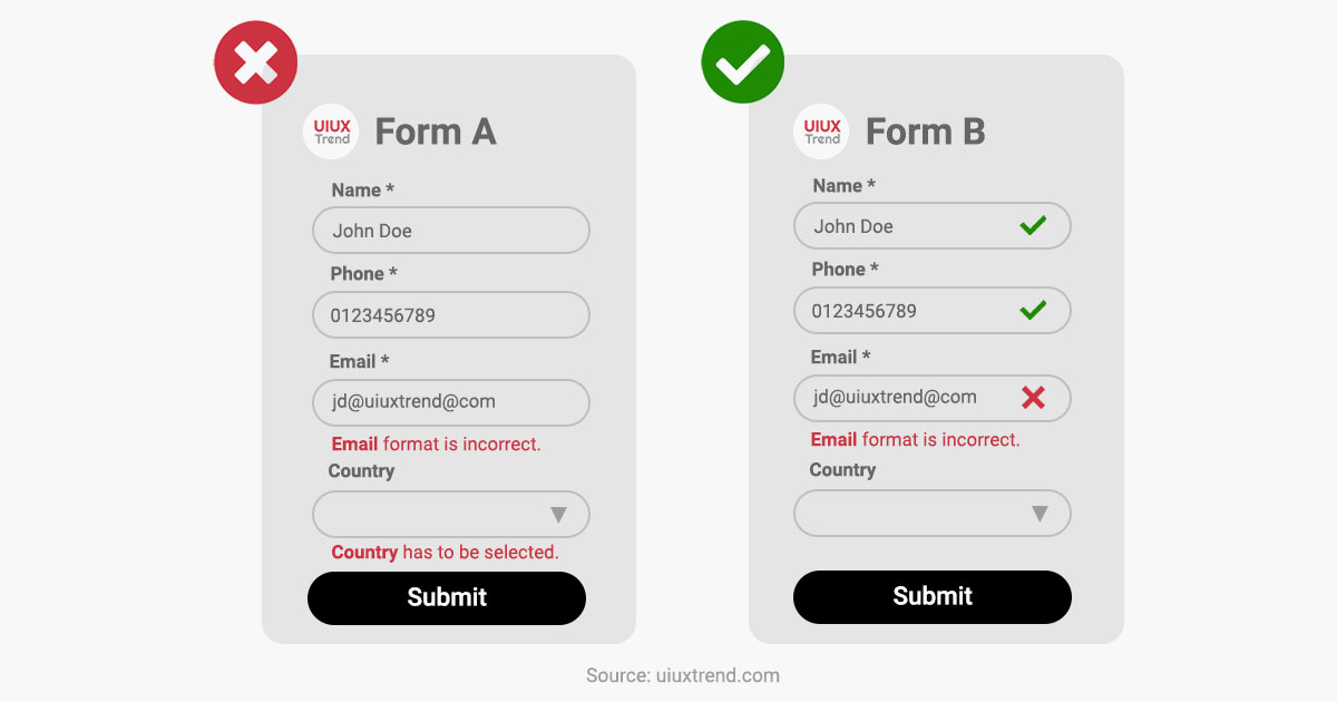
Yes: Validate and display the status for each of the field once it is completed.
No: Validate and display when “submit” button is clicked.
Instead of validating the fields only when the user clicks on the “submit” button, validate a field once it is completed and ready to move on to the next field. The user will be able to correct the error of the preceding field quickly and easily.
This seemingly simple but important design helps to increase the form submission rate and reduce frustration when the user needs to scroll up and down to rectify multiple errors in the fields.
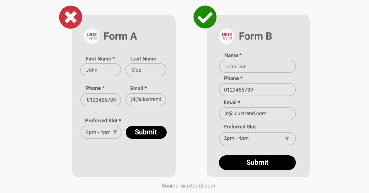
Yes: One column.
No: More than one column.
Using single-column layout keeps the flow of the eyes in a unidirectional flow – from top to bottom. This reduces confusion compared with a multi-column layout whereby the user may get lost on which field she was completing midway through.
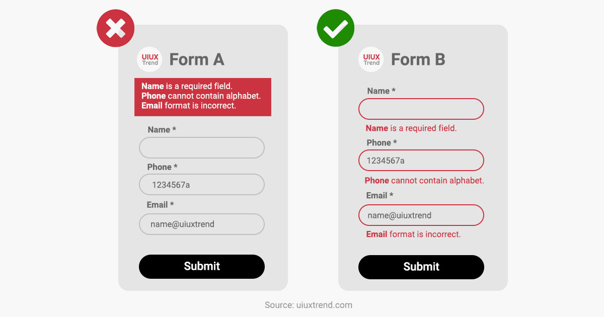
Yes: Each error message should appear directly after the questions.
No: Error messages appear as a list on the top or bottom.
Place the error message directly after each field so that the users do not need to match an error message to its corresponding field. This saves the cognitive load to first remember the field name with error message to scroll down and locate the field.
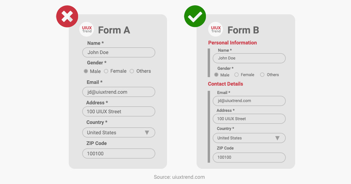
Yes: Group fields into sections.
No: Random listing of fields.
If you have a form with a long list of fields, group related fields into sections. Also, consider implementing a multi-step form and having just one section under each step. This will improve the user experience (UX) and form completion rate compared to completing a form with a long list of unorganized fields to complete.
Yes: “Answer” appears below “Question”.
No: “Answer” and “Question” appear side by side.
When accessing information on a mobile screen, eye tracking research has shown that the users’ eyeballs move from the top to the bottom. If labels are placed adjacent to the fields, users’ eyeballs have to deviate to the left and go back to the right to complete the field before moving down.
On the contrary, placing the labels on top of the fields saves effort, reduces eyeballs movements and thus creates better UI UX experience.