The world of UI and UX is changing very quickly. Technology companies keep on refreshing their look and enhancing their UX. Here are the top UI and UX trends for you to watch out in 2018!
UI Trends of 2018
- Immersive image experience (no more carousel sliders please!)
- Borderless display, akin to a continuous story
- Two-speed trend for UI components and icons
- Personalization in colors
- More cards for mobile web and mobile app
UX Trends of 2018
- More videos for content strategy
- A/B testing made easy
- Killing spree of Adobe Experience Design (Adobe XD)
- Augmented Reality (AR)
1. Immersive image experience
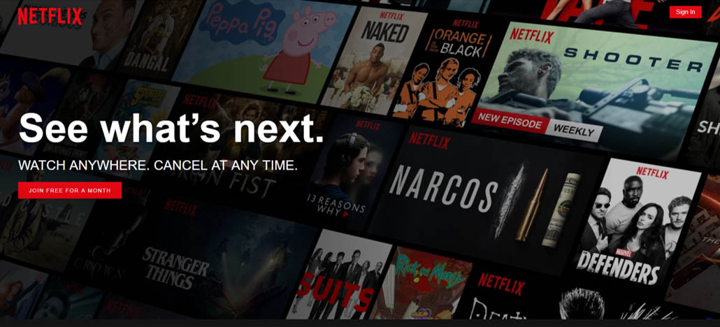
Netflix.com’s Homepage – An eye-catching immersive photo
A simple and original image, representative of your brand is all it takes to make your website stand out.
In the world of UI, a good photo is still widely perceived as the best way to attract attention. Instead of creating a carousel slider to showcase a few of your photos, choose your best image to represent your brand. Your best image should bring out the experience your brand would like to create.
2. Borderless display, akin to a continuous story
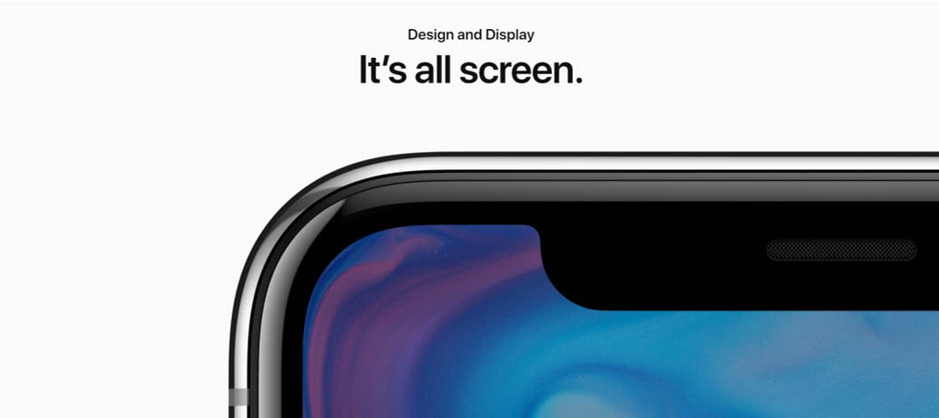
Apple X’s Introduction Page – Redefine grid to tell a story
Apple has released its iPhone X and its website for the introduction of iPhone X is absolutely stunning.
If a good image is all it takes to bring out the best experience of a brand, Apple has used some images of its new iPhone X to create a story-like presentation of its best experience. Moreover, it redefines the rigid grid concept in web design to tell a continuous story and the result is amazing.
Redefining the grid concept effectively removes the box to let you think out of the box. It allows more creativity and originality in designing.
3. Two-speed trend for UI components and icons
![]()
Sample UI Icons from material.io – Free resources you should utilize
Gone are the days when you need to buy icons from an online store such as Dreamstime and Bigstock. With the release of material design resources by Google, icons, colors, imagery, typography, and writing can be downloaded for free from material.io. These resources are readily available for use in your web, Android, and iOS projects.
The best thing is that most users will already be familiar with these icons because they are so common. Therefore, it will greatly minimize the learning curve for users to use your website or application effectively. Most SMEs will likely utilize resources from material.io without hesitation.
However, larger companies especially those in the technology sector are expected to embrace bolder and more creative UI components. They will invest more to create original and new UI components that are unique to their brands.
4. Personalization in colors
Personalization in colors
If you google the latest UI trends in color, the result will either point to calm color palette, bright color or vivid color. After all, Youtube has just redesigned its logo for the first time in 12 years. The new logo now features a vivid red color. According to Christopher Bettig, the head of YouTube’s art department, they wanted to go for something that would tie to video and they settled on #FF0000, a really pure red that goes to the RGB of video.
Yes. Personalization is the key when it comes to deciding the color for your brand or website. There’s no right or wrong color.
Dictionary.com defines personalization as a design tailored to meet an individual’s specifications, needs, or preferences. Instead of following the latest trends in color, conduct user research to find out what suits your users! Do not forget to take into account your brand image, brand heritage, and brand culture too when deciding the color.
5. More cards for mobile web and mobile app
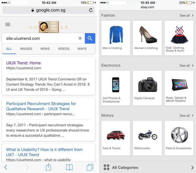
Google’s latest card display for search results and eBay’s card display for its products – More cards for mobile web and mobile app
The prediction that there would be more card display for mobile web and mobile app materialized in 2017 when Google finally revamped its display of individual search results into cards to follow its material design.
Google defines card as a sheet of material that serves as an entry point to more detailed information. Cards may contain a photo, text, and a link about a single subject. On top of this, cards display content of different elements whose size or supported actions vary.
In 2018, there will be more cards around, especially for smaller devices such as mobile web and mobile app. The usage of the card is intuitive in UI because it summarizes information neatly and users will immediately know the choices available.
6. More videos for content strategy
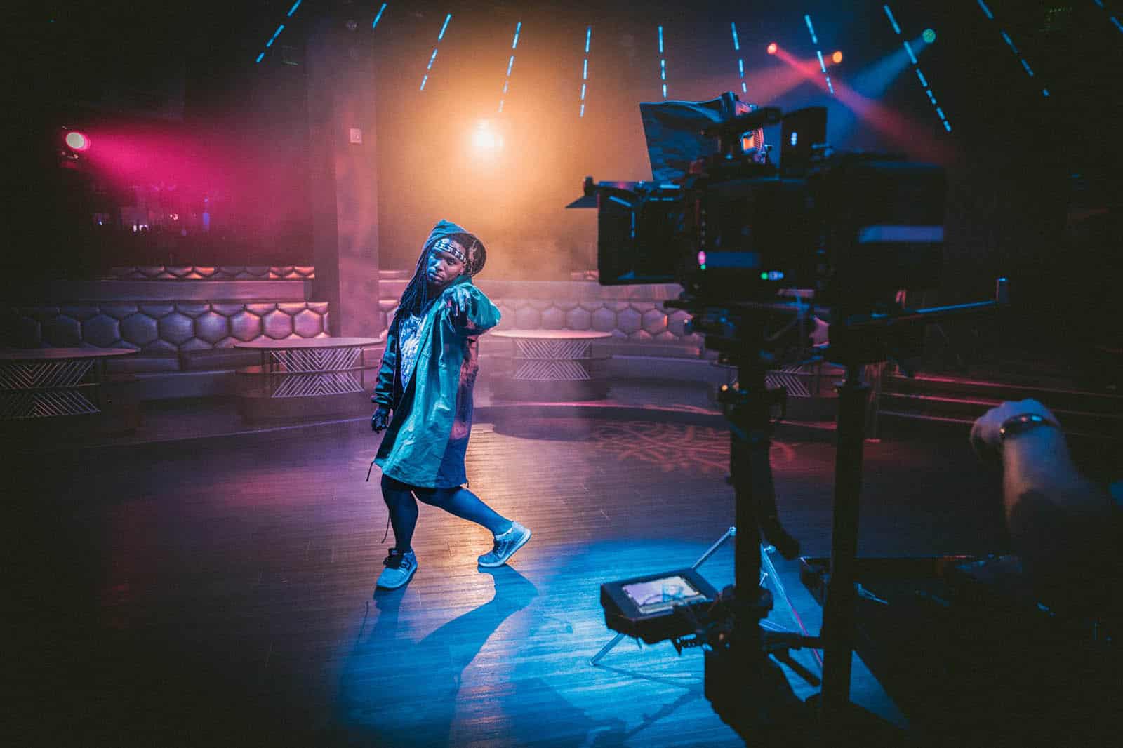
The internet’s next billion users want video and voice.
Content is king and content strategy is one of the elements in UX. A shift toward more videos is one of the important UX trends in recent years to cater to the internet’s next billion users who are less educated.
For the full story and more content strategy trends for 2018, read here.
7. A/B testing made easy
With the release of Google Optimize by Google, A/B testing is now available for everyone. Moreover, it is free! Google Optimize is the lite version of Google Optimize 360 which is not free.
For most of the companies, it is never easy to conduct even the most simple site experiments. UX researchers need to collaborate with the developers to create and deploy website variations. However, with Google Optimize, you can utilize its visual editing interface to make simple text and image changes and Raw HTML/ JavaScript code for more advanced changes.
In 2018, more companies will utilize this free tool for A/B testing. If A/B testing is not part of your process, you should probably start following the UX trends now.
8. Killing spree of Adobe Experience Design (Adobe XD)
Over the years, there are a lot of new start-ups for wireframing tools. However, in 2018, the situation is going to change with more features update and improvements by Adobe XD.
Adobe Photoshop is usually a prerequisite for any designers. The similarity of Adobe XD to Adobe Photoshop makes it an intuitive choice for a new designer to pick Adobe XD for producing wireframe. In addition, it is available for download as part of the Adobe Creative Cloud.
More recently, with the release of Kits with hundreds of free mobile template, web template, component, and icons customized for Adobe XD, it is now easier than ever to create a wireframe. Besides this, there are also other dedicated UI resources for Adobe XD readily available for Microsoft Windows, Apple iOS, and Google Material.
9. Augmented Reality (AR)
From 2018 and onwards, the advancement in augmented reality (AR) will definitely be one of the major UX trends to watch out for. Apple’s new iPhone X is intended to bring augmented reality into the mass.
Augmented reality is a whole new dimension of user experience for mobile devices where users can see digital images overlaid onto the physical world using their smartphones and built-in cameras. While the current AR application is limited to gaming and shopping with a mobile phone, it has the potential to advance into tourism, education, communication or even using a laptop. With AR, the interaction between user and computer will be redefined.

