We are still quite surprised with Adobe’s $20 billion acquisition of Figma as we explore the top UI UX Trends 2023.
It is incredible that a collaborative prototyping tool for the UI UX community could fetch such a high price. UI UX has come a long way over the years to become an indispensable process within companies.
In 2023, the top UI UX trends include major progress in accessibility, augmented reality, and the design process.
Top UI Design Trends of 2023
Top UX Design Trends of 2023
1. Large font size and immersive experience
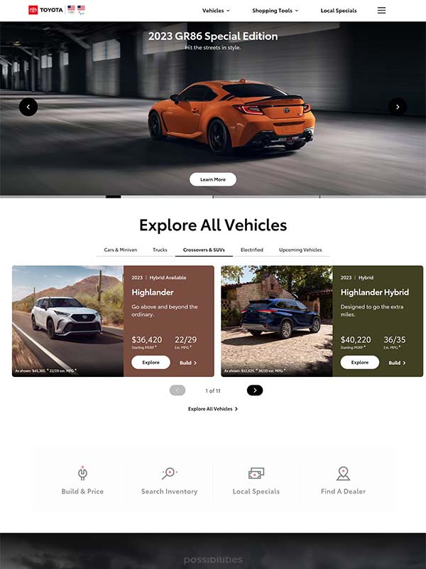
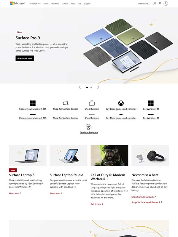
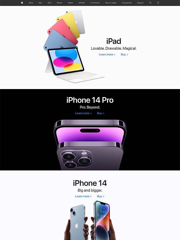
What’s the best way to capture the top UI trends 2023 than browsing through the websites of the top brands in the world? Apple, Microsoft, Toyota, Tesla, McDonald’s, and Louis Vuitton are some of the world’s most valuable brands this year.
Looking at their websites, you can observe a general trend of a homepage that offers an immersive experience. The websites are clean and display only the most important information and categories. These are the largest companies in the world with multiple product segments, categories, and geographical locations, some of their websites used to be loaded with information just a year ago.
Large font sizes are used. Not just large H1, but also large H2, H3, and text!
If your websites are still overloaded with information and irrelevant images, it is never too late to revamp them now! This trend of immersive experience, large fonts, and large images will certainly persist beyond 2023.
2. No more parallax scrolling
A lot of websites will slowly do away with parallax scrolling in 2023. It is no longer in trend and is now an outdated feature!
Parallax scrolling is a visual effect where the background moves at a different speed from the foreground by using CSS. It is effective only when there’s lots of information and it is necessary to bring users’ attention to all the information.
Apple used to adopt parallax scrolling extensively on its homepage but has stopped doing so with the launch of the iPhone 14 series with the Dynamic Island feature. Learn tips on how to design for Dynamic Island here.
3. Generative AI in the design process
You may not have noticed it but generative AI technology has already been powering some of your design processes to make your life easier.
Watch the video below from Adobe to see how generative AI works:

Some of the Adobe features such as Photoshop’s content-aware fill and face-aware liquify or Illustrator’s puppet warp and global edit tool are using generative AI technology too.
There are also plenty of AI-powered websites to help designers generate color palettes for their designs.
More technologies will be released in 2023 to help designers with their everyday job. Start getting used to these features if you haven’t!
4. Make full use of the card UI component
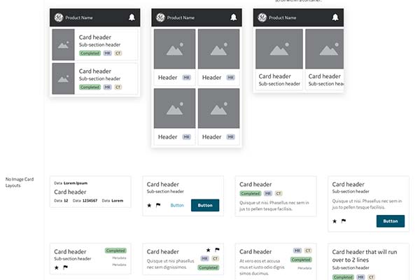
Source: GE’s Edison Design System
As if the card component is not yet widely used, use more card components in your design in 2023, especially for mobile apps or mobile versions of websites. It is one of the top UIUX Trends 2023.
The card component is a flexible container of information. It can be used to display practically any information set, such as previews of products, blog posts, videos, images, instruction steps, tasks, etc. When adopted correctly, cards can effectively organize the information of the interface and greatly increase its user experience.
If you need ideas, tips, or guidelines for your card design, simply search for card components in dribble or learn from the design systems of other brands. Examples include Twilio’s Paste, Shopify’s Polaris, GE’s Edison, and BBC’s Global Experience Language.
5. Light mode with an option for dark mode
If you are designing a product to be used only in low-light environments or for users with impaired visions, there’s no doubt that you should only use dark mode for a better viewing experience.
Other than that, choose light mode with a toggle button for dark mode as part of UI UX Trends 2023!
While there is still an ongoing debate about whether light mode or dark mode is better for eyesight, this can be easily solved when you provide personalizations with both modes available.
Users who feel comfortable with light mode may stay with light mode. Users who prefer dark mode or visually-impaired users may toggle to dark mode. When reading under the sun or by the beach, users on light mode may just change to dark mode and change back to light mode at home.
6. How we build vs What we build

Watch the sharing by Itai Vonshak, the Head of Google Design Platform on the two trends, how we build and what we build, that will shape how we design things in 2023 and beyond. These trends are already being adopted in the industry but will further mature in 2023 as technology advances.
One of the main takeaways is that the deliverables of a UX designer will be reframed with the availability of design to code platforms such as Figma, Webflow, Wix Editor X, or Anima.
It used to be the case that designers do the sketch while the developers settle the rest. However, with these platforms, designers can participate directly in the production by defining all design tokens and elements such as device breakpoint, spacing, styling, etc. As such, the level of completeness in a designer’s deliverables is more demanding than before.
Another interesting point is the concept of personalization. We should build personalized designs for each user, catering to their preference and also some niche users who require accessible design. Despite being fully aware of this, we have chosen to design for an average person as it is easier to do so, no longer for “you”.
Advancements in technology will allow us to create a consistent but personalized and non-uniform design for the users.
7. Mass migration from Adobe XD to Figma
A lot of Adobe Creative Cloud users prefer using Adobe XD over other prototyping tools. This is partly due to its similarity to other Adobe products, hence the low-to-zero learning curve.
However, what will happen next after Adobe’s $20 billion takeover of Figma? Will Figma coexist with Adobe XD?
It seems like Figma will stay. Figma’s co-founder and CEO, Dylan Field announced in his statement that Figma will continue to operate autonomously and will continue to improve Figma Design and FigJam. On top of this, Figma will definitely benefit from Adobe’s technology in digital imaging, video, vector, 3D, AI, machine learning, etc.
Adobe has also recognized Figma superiority’s over Adobe XD in prototyping and as a collaboration tool. It will keep Adobe XD but reduce its investment in it which practically means that Adobe XD may be indeed phased out in the future.
In 2023, expect to see Adobe XD users’ mass migration to Figma. And for Figma users, since its management team will retain their autonomy, there’s really no rush to shift to Penpot right?
8. Accessibility becomes a legal requirement
All European Union member states have adopted European Accessibility Act into law this year. By 2025, applicable enterprises within the member states will need to fully observe this legal requirement.
What will change? These enterprises will need to adopt a set of common rules on accessibility standards applicable to a wide range of products and services, from computers, operating systems, ATMs, smartphones, banking services, and e-books to e-commerce.
This is great news as persons with disabilities and the elderly can finally enjoy accessible products and services without barriers.
In 2023, even if you are not in the EU, you should start to apply accessibility standards and guidelines across all your products and services.
9. Incorporating AR into everyday life
Source: Adobe
10. Creating values through qualitative UX research
Qualitative UX research will make a big comeback in 2023!
If you are still focusing only on quantitative user research, it is time to complement your study with qualitative research. Over the past three years, a lot of research teams have neglected qualitative UX research due to COVID restrictions and also reluctance to return to the office. One-way mirror facilities have been severely underutilized.
The good news is that we have seen an upward trend in one-way mirror facilities usage or even plans to build a new one in 2023 in the US, in Europe, and also in the Asia Pacific.
When budget allows, aim to perform evaluative UX research once every week and generative UX research once every month. While evaluative research is important to keep track of your product’s performance and improve user experience, generative research helps you to understand your users and capture any changes in consumer behaviors. Both are essential for your products and services to stay relevant.
Read more: Participant Recruitment Strategies for Qualitative Research

