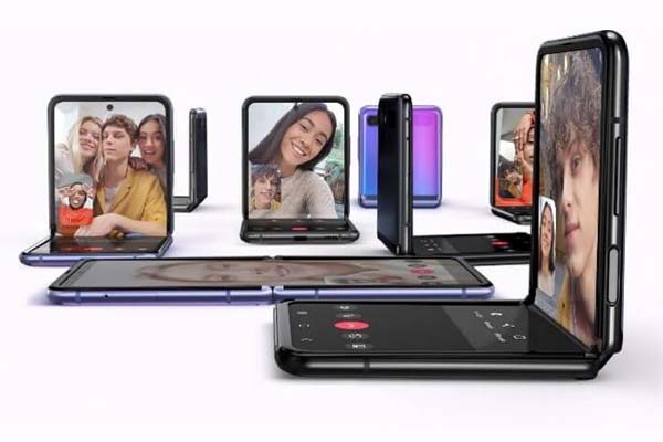
Samsung launched its second foldable phone, Samsung Galaxy Z Flip in 2020 and it is more than just a replacement for smartphone stand.
It significantly improves the user experience of multitasking over split-screen on smartphones and it presents potentials to become mainstream. UX designers will need to design an app that blends harmoniously with other apps when used together over split-screen.
The introduction of “Flex mode” may also revolutionize how an app’s visual design is done up until now.
1. Multitasking
Android Multitasking
Google has made split-screen multitasking available since Android Nougat (version 7). In 2019, Samsung released its first foldable phone, Galaxy Fold.
With the introduction of Samsung Galaxy Z Flip, multitasking has been made very important since it is one of its few key features and USP. Many online outlets and retail stores are sold out of this foldable phone.
Apple Multitasking
Apple also allows multitasking through a split view, slide over or picture-in-picture, albeit only available on iPad at the moment.
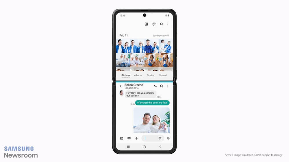
It is now inevitable for UX designers to put more thoughts on interaction design and visual design for split-screen multitasking when designing new apps.
UX designers must design an app interface with the following features:
- Flexible and adaptable interface: Adaptable interface automatically switches its UI elements and layouts when viewed in full-screen mode or split view across different devices of different sizes.
- Support both dark mode and light mode
- With reduced information density
- Follow Google’s Material Design tightly to ensure consistency across apps when viewed in a split view (follow Apple’s Human Interface Guidelines if you designing for iPad’s multitasking).
2. Flex Mode
What is Flex mode?
Samsung works with Google to introduce Flex mode. It is exclusively for Galaxy Z Flip for now, albeit not for long. According to The Verge, the flex mode isn’t just for Samsung foldables, it will be available to other phone makers soon.
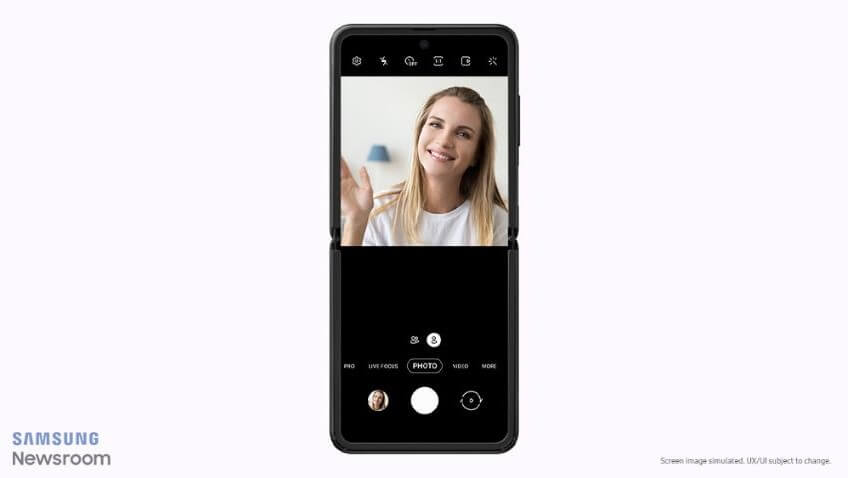
Flex mode is activated when the user folds or unfolds their phone, and when the device is free-standing. It automatically splits the display into two four-inch screens with
- Top half as contents
- Bottom half as controls
Do not confuse flex mode with split-screen multitasking. Split-screen multitasking allows users to use 2 apps at the same time by splitting the display into 2 screens. Flex mode splits the display into 2 screens too but for use by only 1 app, with different functionalities on the 2 screens.
Apps will need to be flex-mode optimized to use this feature on Galaxy Z Flip.
Challenges for UX Designers
Flex mode is uncharted territory for designers. It is something completely new.
Designers may redefine the functionalities and designs for the top half and bottom half.
While the flex-mode optimized apps are limited to the built-in camera and gallery apps, Google Duo and Always-On Display (AOD), its potential is definitely larger.
Have you started designing for Flex mode? Share with the community your thoughts in the comment section below.

